
A wildflower meadow offers far more color inspiration than simple floral pinks. Think cornflower blue against green stems, creamy chamomile petals, scarlet poppies, faded lavender, clover pink, and the earthy neutrals hiding beneath all that color.
These 19 crochet phone pouch ideas explore that range through floral motifs, granny-square looks, bobble texture, stripes, color blocking, scallops, fringe, and softer botanical details. Use the collection as a visual reference for comparing silhouettes, choosing a palette, exploring strap styles, or deciding how subtle or expressive you want a future crochet accessory to feel.
About These Ideas
These concepts are meant for visual inspiration, color exploration, style comparison, and creative planning. Borrow a palette, motif arrangement, edging idea, proportion, or styling direction that suits your own taste rather than treating any one concept as a fixed design.
Quick Idea Finder
| If You Like… | Explore These Looks |
|---|---|
| Fresh cottage florals | Daisy-Dotted, Blue Cornflower, Chamomile Cream |
| Soft romantic color | Pink Clover, Forget-Me-Not, Pastel Meadow |
| Earthy countryside style | Woodland Wildflower, Prairie Fringe, Pressed-Flower Neutral |
| Brighter statement color | Poppy Red, Sunlit Meadow, Golden Hour |
| Richer dramatic palettes | Berry Blossom, Midnight Meadow |
| Noticeable crochet texture | Meadow Green Bobble, Wildflower Granny Square |
| Playful details | Buttercup Yellow, Tiny Blossom Drawstring |
Before You Choose
Think first about how prominent you want the pouch to feel when worn. Tiny allover flowers create a busier cottage look, while one or two accent colors feel cleaner and more modern. A longer strap can make the pouch part of an outfit, whereas a compact silhouette feels more like a small functional accessory. Also consider whether you prefer smooth visual texture, dimensional bobbles, granny-square motifs, scalloped edging, or fringe before settling on the color palette.
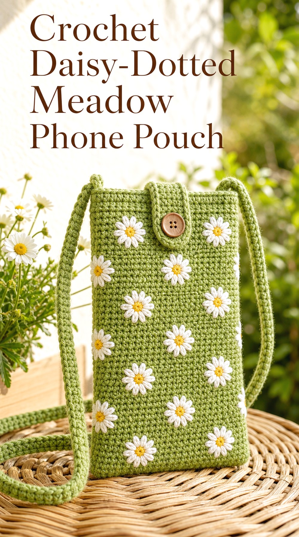
1. Daisy Dotted Meadow Phone Pouch
 Save
SaveA fresh green pouch scattered with little white daisies captures the most recognizable side of wildflower-meadow style without becoming overly decorative. The contrast between a grassy base and pale petals keeps the floral details easy to notice, while a slim rectangular silhouette stops the look from feeling too sweet. It is especially appealing for spring and early-summer accessory inspiration.
Why This Look Works
Daisies have a simple round shape, so they sit naturally against visible crochet texture without creating too much visual clutter. Repeating them with generous green space between each bloom gives the pouch a light, breezy rhythm.
Color Direction
Try leaf green with warm white and golden centers for the clearest meadow reference. Sage with ivory creates a quieter cottage version, while deeper forest green makes the white flowers look sharper and more graphic.
Styling Direction
This palette works easily with denim, cream linen, light khaki, and simple cotton dresses. Keeping the strap in the main green tone helps the flowers remain the strongest detail.
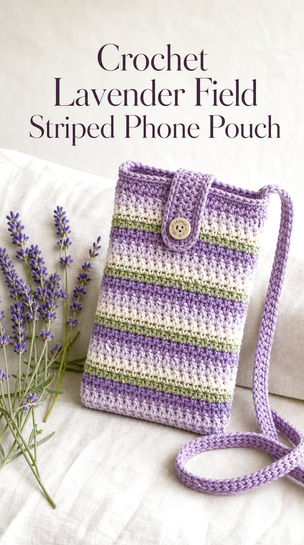
2. Lavender Field Striped Phone Pouch
 Save
SaveInstead of using individual flowers, this concept translates a field of lavender into narrow bands of lilac, dusty purple, soft cream, and muted green. The striped direction feels more streamlined than a floral motif while still keeping the countryside reference clear. It is a good choice for anyone drawn to botanical color but wanting a cleaner everyday accessory.
Visual Balance
Alternating pale and mid-tone stripes keeps the pouch from becoming a solid block of purple. A few slim green bands can suggest stems and foliage without turning the design into a literal flower scene.
Texture Direction
A visibly ridged or softly ribbed surface can make each stripe feel more tactile. For a smoother impression, keep the texture consistent and allow the color transitions to provide most of the movement.
A Softer Variation
Use lavender mist, pale gray, cream, and muted sage for an almost watercolor-like interpretation. This version pairs especially well with light neutral wardrobes and understated spring styling.
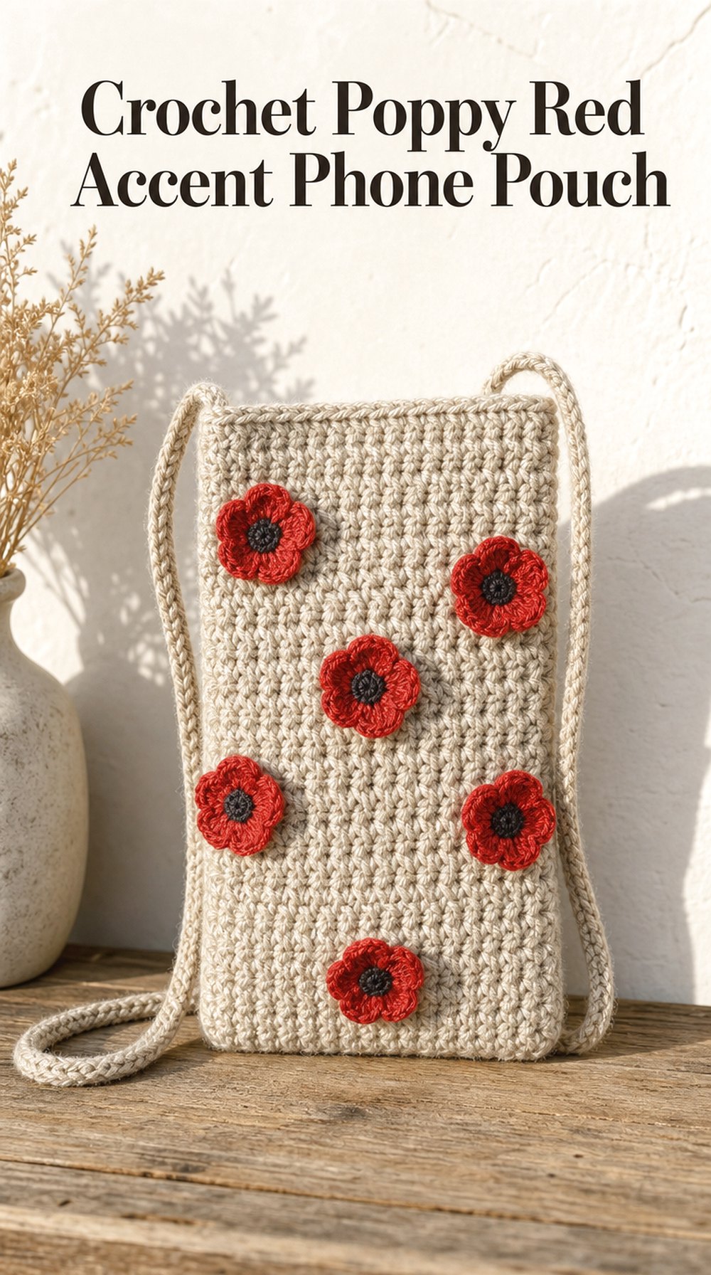
3. Poppy Red Accent Phone Pouch
 Save
SaveBright poppy red needs very little repetition to make an impact. An oatmeal or warm beige crochet pouch with several scattered red floral accents feels lively while preserving plenty of neutral space. Tiny dark centers can sharpen the floral shapes and introduce a touch of contrast that gives the pouch a slightly more graphic, contemporary personality.
Statement Element
The red flowers should act as focal points rather than cover the entire surface. A few intentionally spaced accents can make the design feel more considered and keep the natural yarn texture visible.
Color Mood
Oatmeal, poppy red, muted olive, and charcoal create a grounded palette reminiscent of flowers growing through dry summer grass. Swap charcoal for warm brown if you prefer a softer countryside mood.
Outfit Pairing
This concept would stand out against monochrome cream, faded denim, olive jackets, or black basics. Because the flowers already provide strong color, a neutral strap keeps the overall accessory balanced.
4. Blue Cornflower Cottage Phone Pouch
 Save
SaveCornflower blue brings a cooler note to the meadow palette. Set against cream with small mossy-green accents, it feels crisp, nostalgic, and slightly vintage without becoming dark. A restrained scalloped edge can reinforce the cottage influence while leaving the rectangular phone-pouch silhouette neat enough for casual everyday styling.
Design Detail to Notice
The combination of tiny blue motifs and restrained edging gives this concept two layers of decoration. Keeping the scallops modest prevents the top of the pouch from competing with the flowers.
Where This Look Fits
This is an easy direction for cottagecore, garden-inspired, and country-summer wardrobes. It also transitions nicely into early fall when styled with denim, oatmeal knits, or muted blue layers.
Creative Variation
For a fresher look, introduce occasional pale yellow centers. For a moodier version, switch cream to mushroom beige and deepen the blue toward indigo.
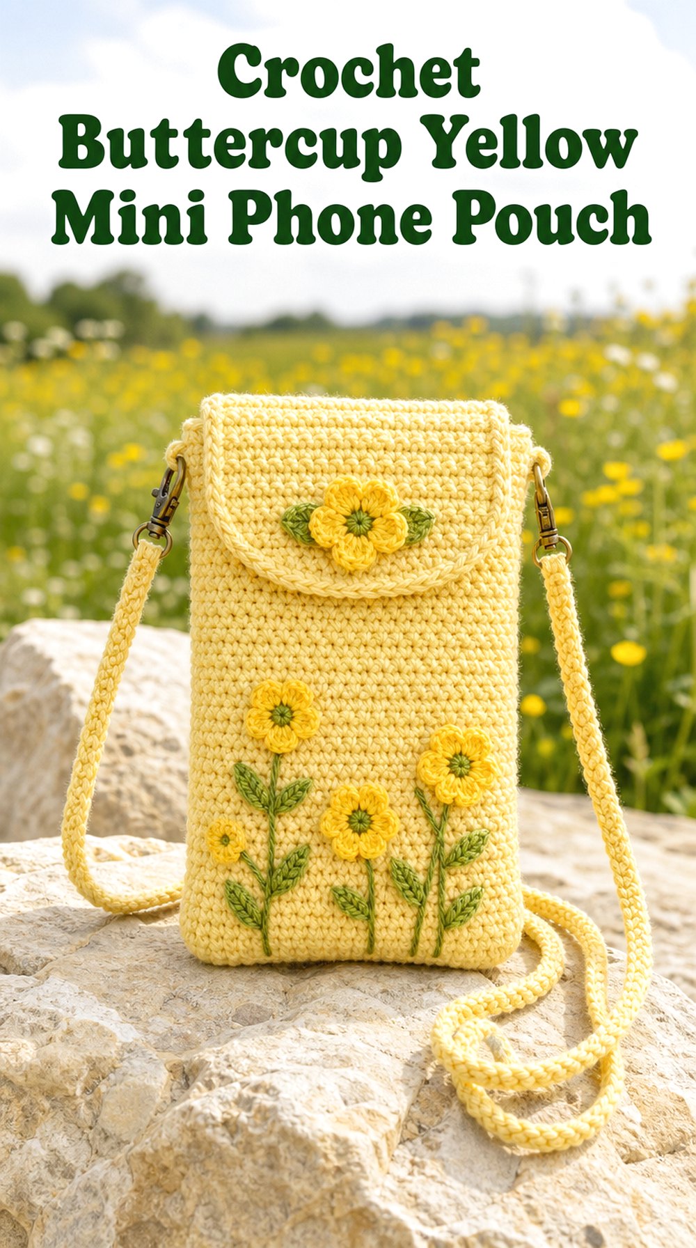
5. Buttercup Yellow Mini Phone Pouch
 Save
SaveSoft yellow gives a small phone pouch an immediate sunny quality. Rather than covering the accessory with multiple colors, this concept lets creamy buttercup tones dominate, with only tiny green or white details to suggest the meadow theme. The result feels playful, compact, and easy to imagine as a cheerful warm-weather accent.
Size Direction
A visually compact silhouette suits this brighter palette because the yellow reads as a concentrated pop of color. Keeping decorative details small also helps the accessory maintain a neat appearance.
A Playful Direction
Tiny flower clusters, miniature scallops, or a contrasting green strap could make the concept more whimsical. Choose one standout feature rather than combining every decorative possibility.
Seasonal Twist
Butter yellow looks particularly fresh for spring and high summer. For late summer, shift toward honey or mustard and pair it with olive rather than fresh green.
6. Forget Me Not Blue Phone Pouch
 Save
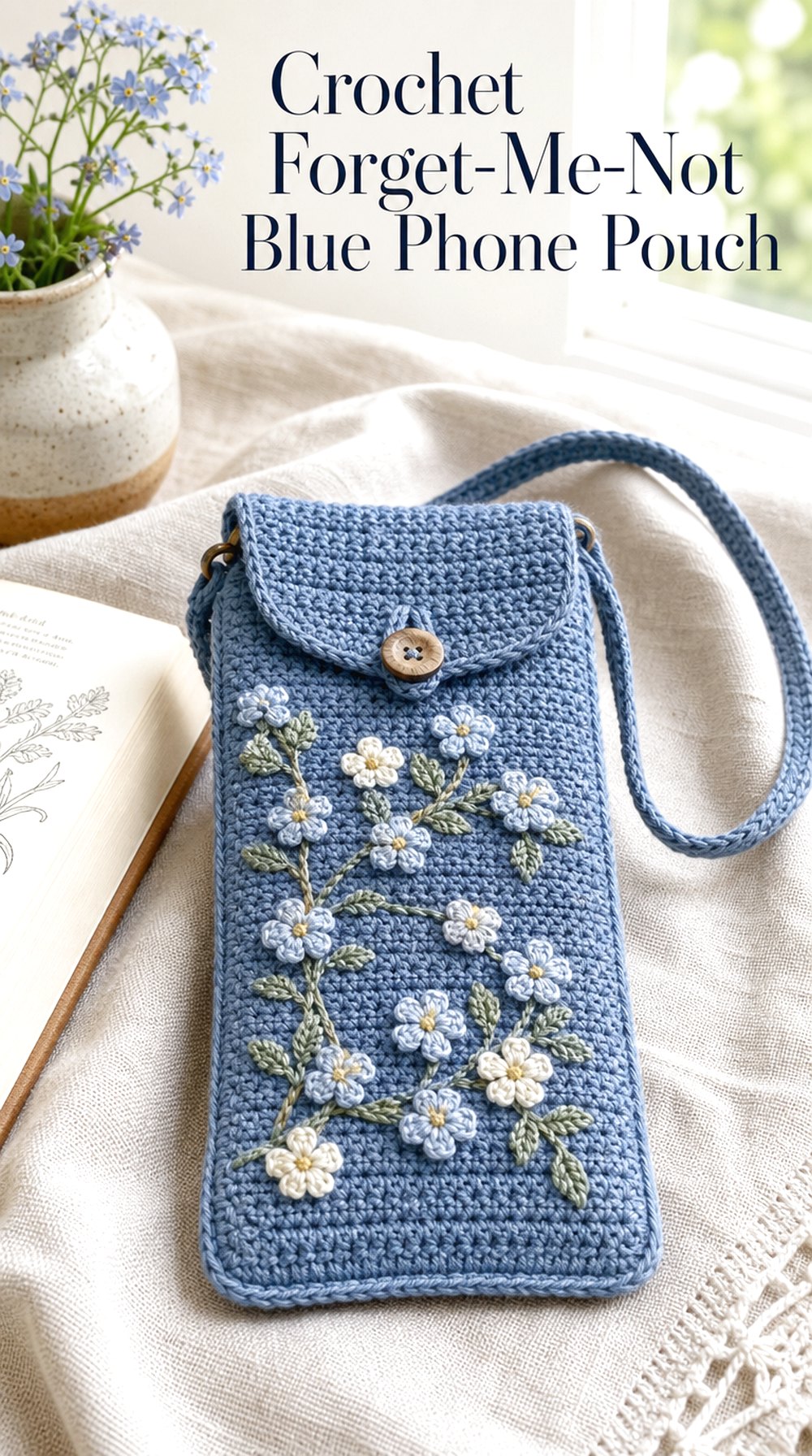
SaveDusty sky blue with miniature pale blossoms creates one of the gentlest concepts in the collection. The low-contrast palette gives the pouch a soft, sentimental quality, especially when paired with small cream highlights and restrained leafy details. It offers floral interest without the strong contrast of red poppies or bright daisies.
Color Mood
Stay within cool blue, cream, and faded green for a calm palette. A tiny touch of lavender can add depth while preserving the subdued meadow character.
Visual Focus
Because the colors are close in value, stitch texture becomes more noticeable. An uncluttered base allows the tiny blossoms to appear delicate rather than disappearing into too much surface detail.
Gift Inspiration
This softer direction has a gentle, keepsake-like feel that can suit gift planning. Personalizing the palette around a favorite blue or meaningful flower color could make the inspiration feel more individual.
7. Wildflower Granny Square Phone Pouch
 Save
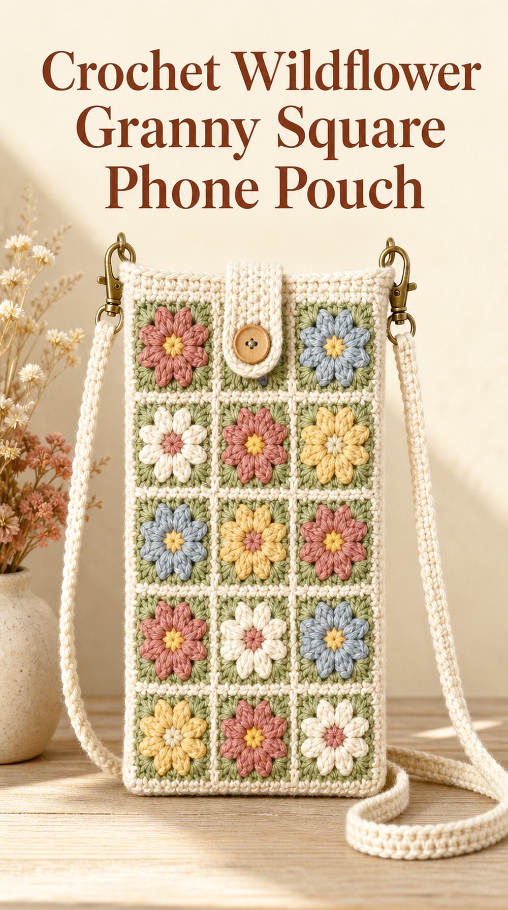
SaveSmall floral granny-square motifs turn a simple phone pouch into a patchwork-style celebration of meadow color. Cream borders can unite dusty pink, sage, blue, and butter-yellow centers, giving each motif its own identity while keeping the overall accessory coherent. The visible geometry also provides a useful contrast to the organic wildflower theme.
What Makes It Stand Out
The square framework introduces order around a mix of floral colors. That tension between structured blocks and loose meadow-inspired hues gives the pouch more visual personality than a single repeating motif.
Color Direction
Keep one joining or border shade consistent across the design. Cream offers a light cottage look, while moss, tan, or deep brown would make the same colorful motifs feel earthier.
Modern Update
For a cleaner interpretation, limit the palette to three colors across all the squares. A cream, sage, and cornflower-blue version would retain the granny-square character while looking more restrained.
8. Pressed Flower Neutral Phone Pouch
 Save
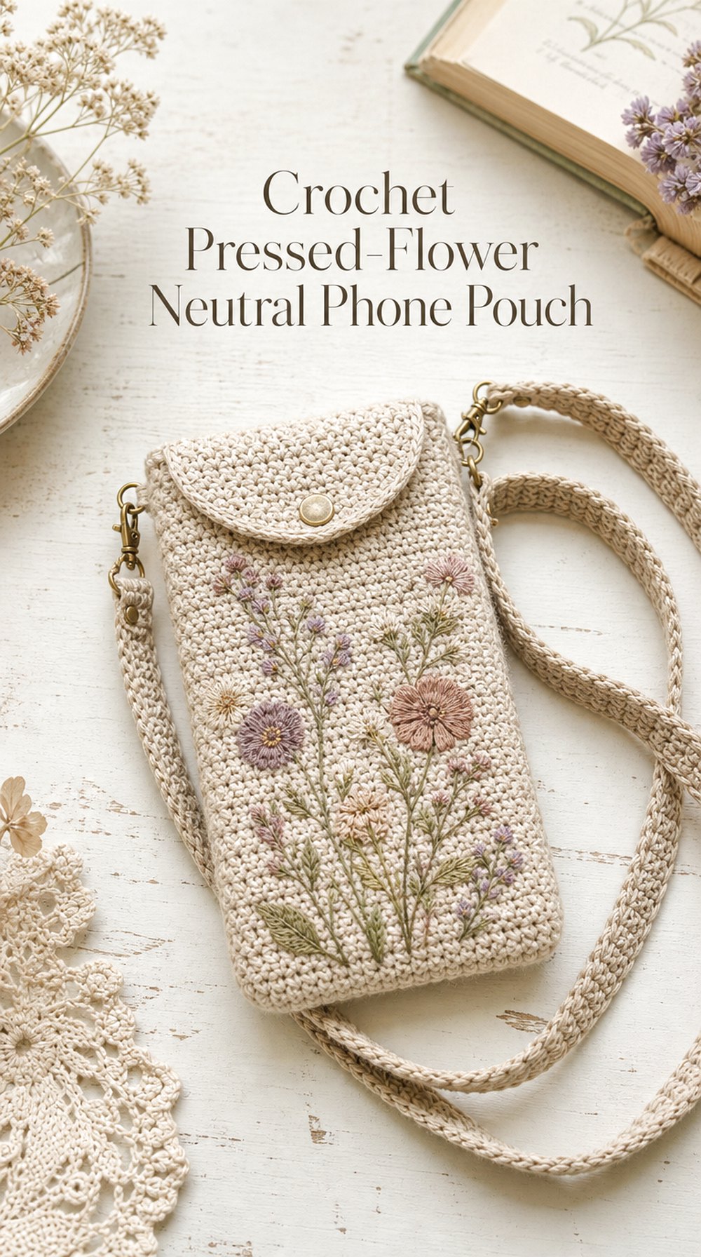
SaveA muted neutral base with faded botanical colors feels more like a page from a pressed-flower journal than a bright summer field. Think flax, oatmeal, dusty rose, weathered lavender, and soft olive arranged sparingly across the surface. This approach works especially well for readers who enjoy floral inspiration but usually prefer understated accessories.
Why the Palette Works
Muted shades have similar softness, so no single detail overwhelms the others. The result feels layered and botanical while still sitting comfortably alongside neutral clothing.
Vintage-Inspired Touch
Faded colors, delicate edging, and an aged-paper palette can strengthen the pressed-flower feeling. A simple strap is useful visually because it keeps the nostalgic details from becoming too ornate.
Everyday Version
Strip the concept back to oatmeal with just dusty rose and olive accents. The smaller palette feels easier to mix with everyday outfits while preserving the original botanical direction.
9. Meadow Green Bobble Phone Pouch
 Save
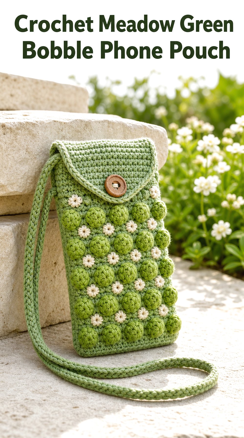
SaveThis idea draws from flower buds and seed heads rather than copying petals directly. Raised bobble-like texture scattered across several shades of green gives the pouch a tactile meadow surface, with optional cream accents providing just enough contrast. It is a strong choice when texture matters more than obvious floral imagery.
Texture Direction
Dimensional details naturally catch light and shadow, helping a mostly green design avoid looking flat. Leaving some calmer sections between raised areas gives the surface better visual breathing room.
Color Direction
Combine sage, leafy green, and a small amount of cream for freshness. Olive, moss, and warm brown move the same concept toward a late-summer or early-fall field.
Practical Style Angle
Because the texture already makes a statement, a straightforward silhouette and uncomplicated strap create a better visual balance. This keeps the pouch interesting without making every element decorative.
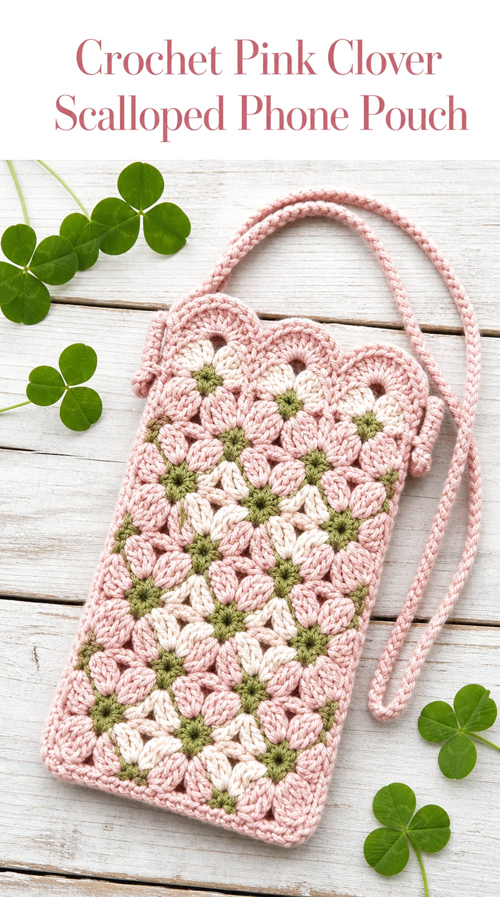
10. Pink Clover Scalloped Phone Pouch
 Save
SaveBlush pink, cream, and moss green create a romantic clover-inspired pouch that feels softer than the classic bright wildflower palette. Gentle scallops around the opening echo petal shapes and give the top edge a decorative finish. The combination would suit anyone drawn to cottage florals, muted pinks, and subtly feminine accessories.
The Detail That Changes It
The scalloped edge is central to the character of this concept. Without it, the pouch would feel much simpler; with it, the silhouette gains a delicate floral rhythm even from a distance.
Visual Balance
Keep most of the pouch in one blush tone, then use green and cream as smaller accents. Too many competing pink shades could weaken the clear clover-inspired color story.
A Bolder Variation
Shift blush toward raspberry and make the foliage deeper green. The stronger contrast preserves the same floral idea but turns it into more of a statement accessory.
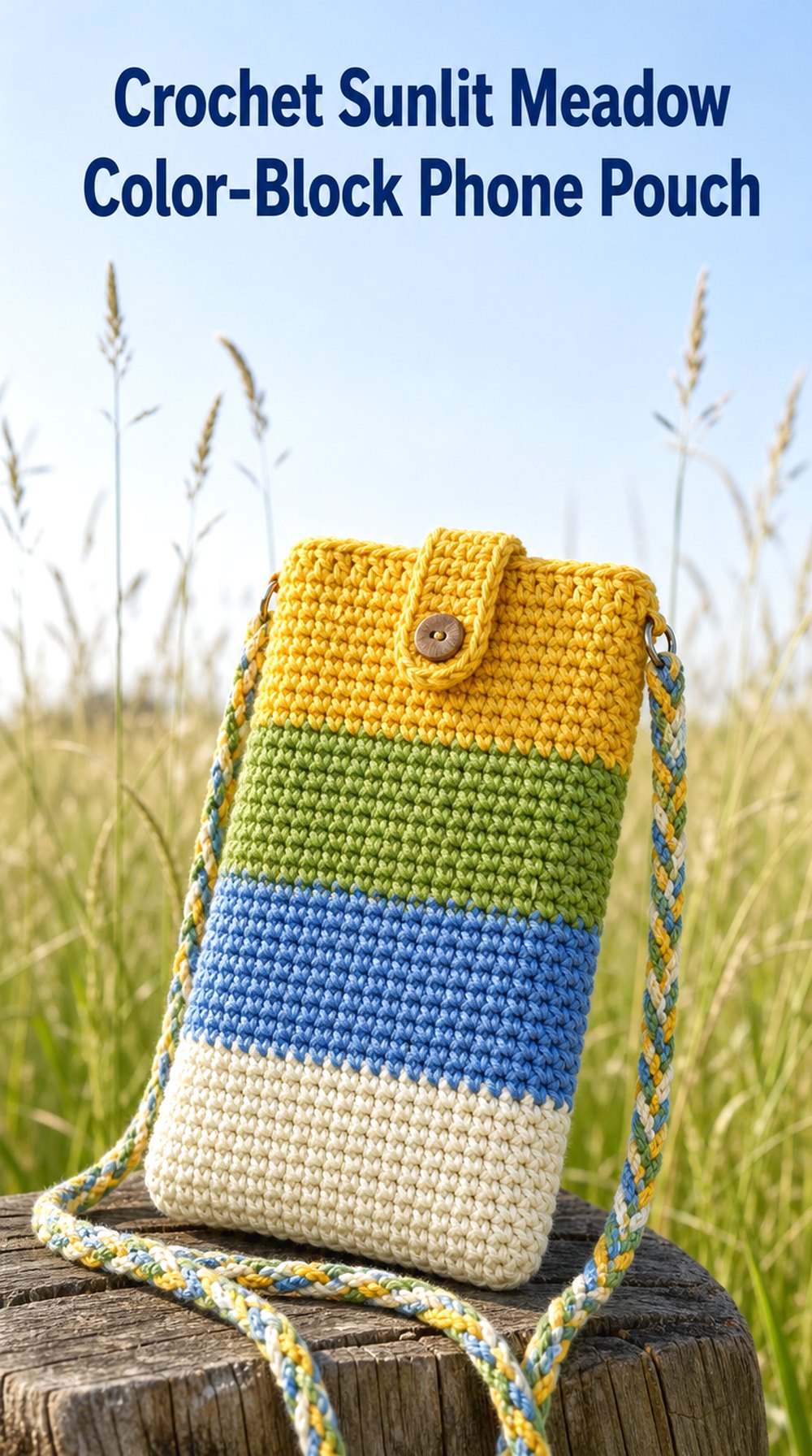
11. Sunlit Meadow Color Block Phone Pouch
 Save
SaveGolden yellow, grassy green, cornflower blue, and cream can suggest a sunny meadow even without a single flower motif. Broad blocks of color make this one of the most contemporary concepts in the group. The simpler shapes let the palette provide all the personality, creating an option that feels botanical in mood rather than literal in decoration.
Modern Update
Clean rectangular blocks and a straightforward silhouette make the meadow theme feel graphic. Unequal sections can look more dynamic than perfectly even stripes, especially when one neutral shade anchors the brighter colors.
Color Relationship
Yellow and blue create strong visual energy, while green bridges the two naturally. Cream gives the eye a resting point and stops the brighter shades from feeling too intense.
Where This Look Fits
This direction works well with simple summer outfits, denim, sneakers, and casual layers. It can also appeal to anyone who likes wildflower colors but not obviously floral accessories.
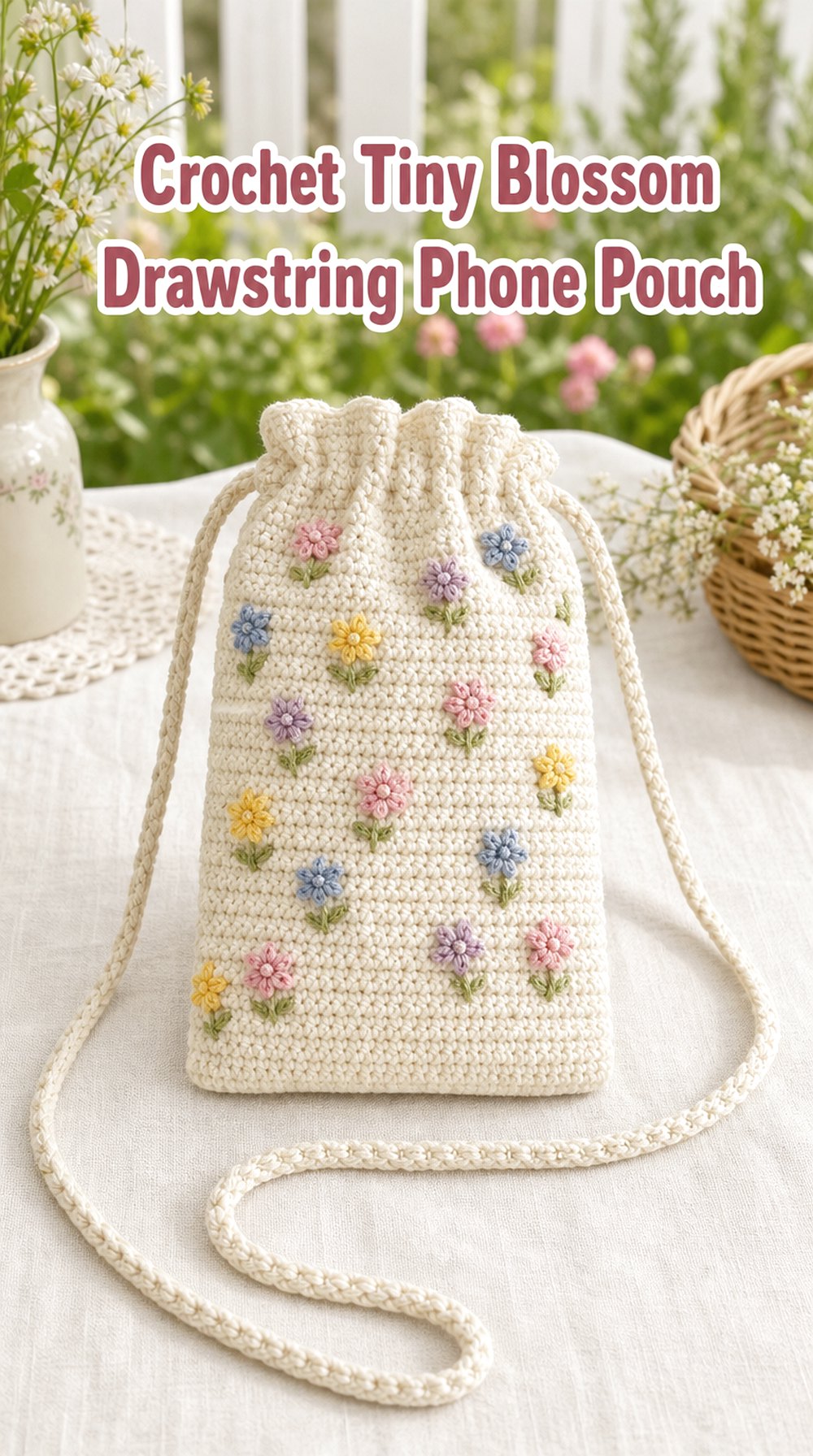
12. Tiny Blossom Drawstring Phone Pouch
 Save
SaveA cream base scattered with tiny multicolored blossoms gives this pouch a miniature garden feeling. A softly gathered top adds a playful silhouette change from the straighter designs in the collection, while pink, blue, yellow, and lavender details create a cheerful meadow mix without requiring large motifs.
Shape Inspiration
The slightly gathered opening makes the pouch look softer and more relaxed. It works best visually when the lower body remains fairly streamlined so the upper detail can stand out.
Color Direction
Keep the base neutral and let the tiny flowers carry the palette. Using several colors in small amounts often feels lighter than giving each hue a large section of the pouch.
A Cleaner Version
Choose only two blossom colors, such as lavender and yellow, on a cream background. The reduced palette keeps the charming scattered-flower effect while making the overall look calmer.
13. Woodland Wildflower Phone Pouch
 Save
SaveNot every meadow is bright and sunny. This concept moves toward the woodland edge, combining moss, fern green, bark brown, muted berry, cream, and tiny floral accents. The darker grounding colors make the pouch feel earthy and natural, offering an appealing alternative to pastel cottage palettes.
Seasonal Twist
These shades transition easily from late summer into fall. Rust, deep berry, and brown can become slightly more prominent as the season changes, while cream keeps the mixture from feeling heavy.
Texture Direction
A subtly uneven or richly textured surface complements the woodland mood. Floral details can remain small and slightly irregular in placement so the design feels less formal.
Styling Direction
Pair this direction with olive jackets, brown boots, denim, warm knit layers, or natural linen. It works particularly well when the surrounding outfit already uses earthy neutral
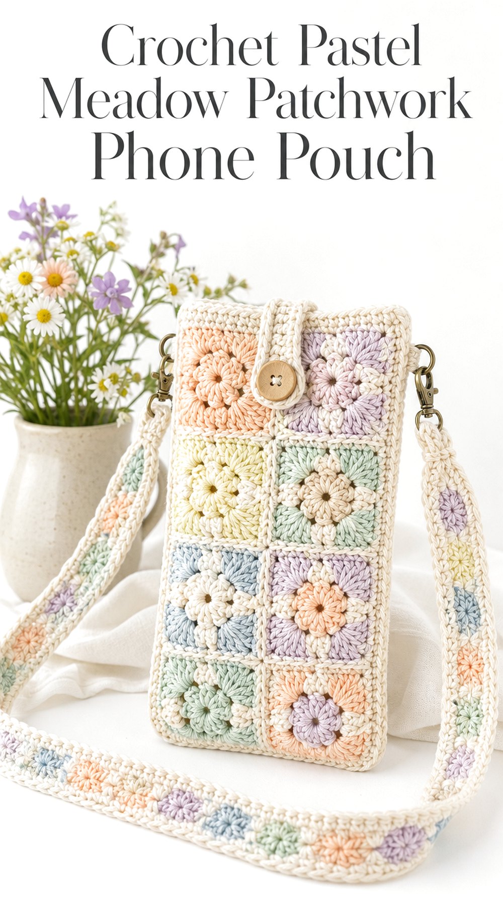
14. Pastel Meadow Patchwork Phone Pouch
 Save
SavePeach, mint, lilac, powder blue, buttercream, and ivory turn meadow inspiration into a light patchwork palette. Rather than using realistic floral colors, this concept softens everything into a playful pastel interpretation. Small blocks or motif areas keep each hue distinct and give the pouch a cheerful handmade character.
Visual Balance
Pastels can blur together when every shade has equal visual weight. An ivory border or joining color creates useful separation and makes the patchwork arrangement easier to read.
A Softer Variation
Replace peach and buttercream with pale gray and blush for a more muted version. The finished color story would feel less playful and more calm, while retaining the layered patchwork effect.
Gift Inspiration
This palette can be personalized easily around someone’s favorite colors. Selecting three or four tones rather than all six can make the concept feel more tailored and less busy.
15. Golden Hour Wildflower Phone Pouch
 Save
SaveThis pouch takes its cues from the warm light over a meadow near sunset. Honey, amber, terracotta, olive, muted rose, and cream create a richer palette than the fresh greens of spring. Scattered floral touches keep the wildflower connection clear while the deeper colors give the accessory an easy late-summer and autumn mood.
Color Mood
Warm shades look especially cohesive when they share an earthy undertone. Terracotta and honey provide energy, while olive and cream ground the brighter areas.
Where This Look Fits
This concept pairs naturally with camel, rust, warm denim, brown leather accents, or cream knitwear. It can bridge seasons more easily than a distinctly pastel floral pouch.
Detail Worth Borrowing
Even if the full palette feels too warm, the combination of muted rose and olive against honey is worth considering. Those three shades alone capture much of the golden-hour atmosphere.
16. Chamomile Cream Phone Pouch
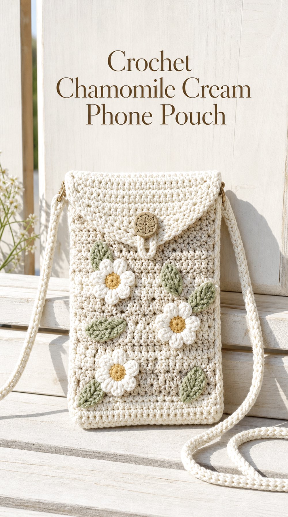 Save
SaveCreamy neutrals paired with little white-and-gold flower details create a quiet chamomile-inspired look. Because the petals sit close to the base color, the centers and green leaves become especially important visual accents. The effect is light, clean, and botanical without introducing the busier color mix of a traditional wildflower field.
Why This Look Works
Low contrast lets the yarn texture remain visible rather than making every flower the focal point. Small golden centers provide just enough warmth to distinguish the floral forms.
A Cleaner Version
Skip most of the leafy details and use cream, white, and muted gold alone. The nearly monochrome approach would feel especially minimal while still carrying a floral reference.
Styling Direction
This palette suits neutral outfits and natural textures such as linen, denim, canvas, and light knits. A cream or flax-toned strap would maintain the understated character.
17. Berry Blossom Crossbody Phone Pouch
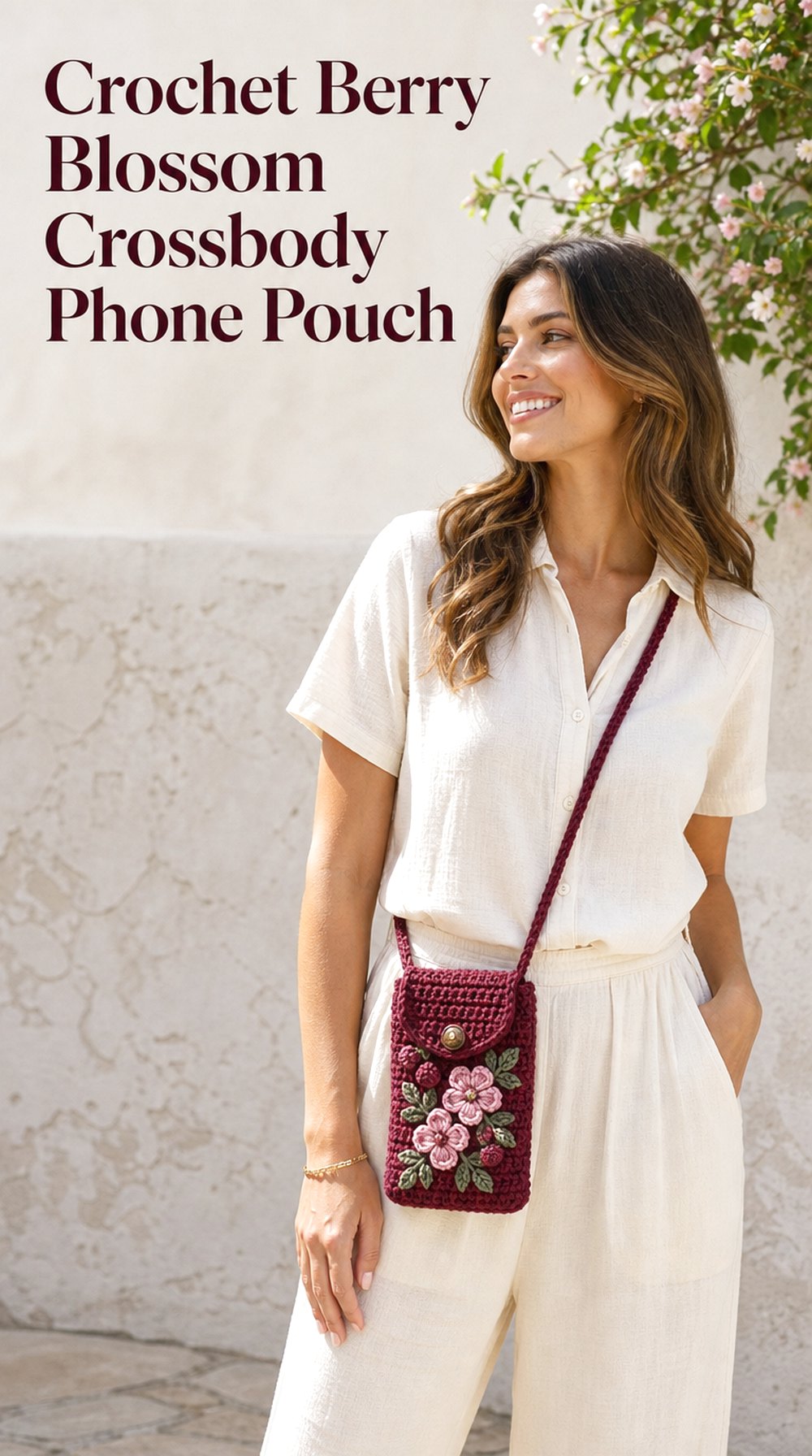 Save
SaveDeep berry yarn paired with dusty pink flowers and muted green leaves creates a much richer floral direction. The darker base gives the blossoms more contrast, making them appear almost jewel-like while still staying within a meadow-inspired palette. A long crossbody strap helps turn the phone pouch into a noticeable part of an outfit.
Outfit Pairing
Cream, charcoal, denim, and muted olive all give the berry tones room to stand out. Keeping nearby accessories relatively simple prevents the floral pouch from competing with other statement pieces.
Color Direction
Wine, raspberry, dusty pink, moss, and cream make a layered palette without becoming overly bright. For a cooler interpretation, replace moss with gray-green and shift raspberry toward plum.
Statement Element
The strong base color is already dramatic, so flower placement can remain restrained. A few concentrated clusters may have more impact than covering the entire pouch.
18. Prairie Fringe Phone Pouch
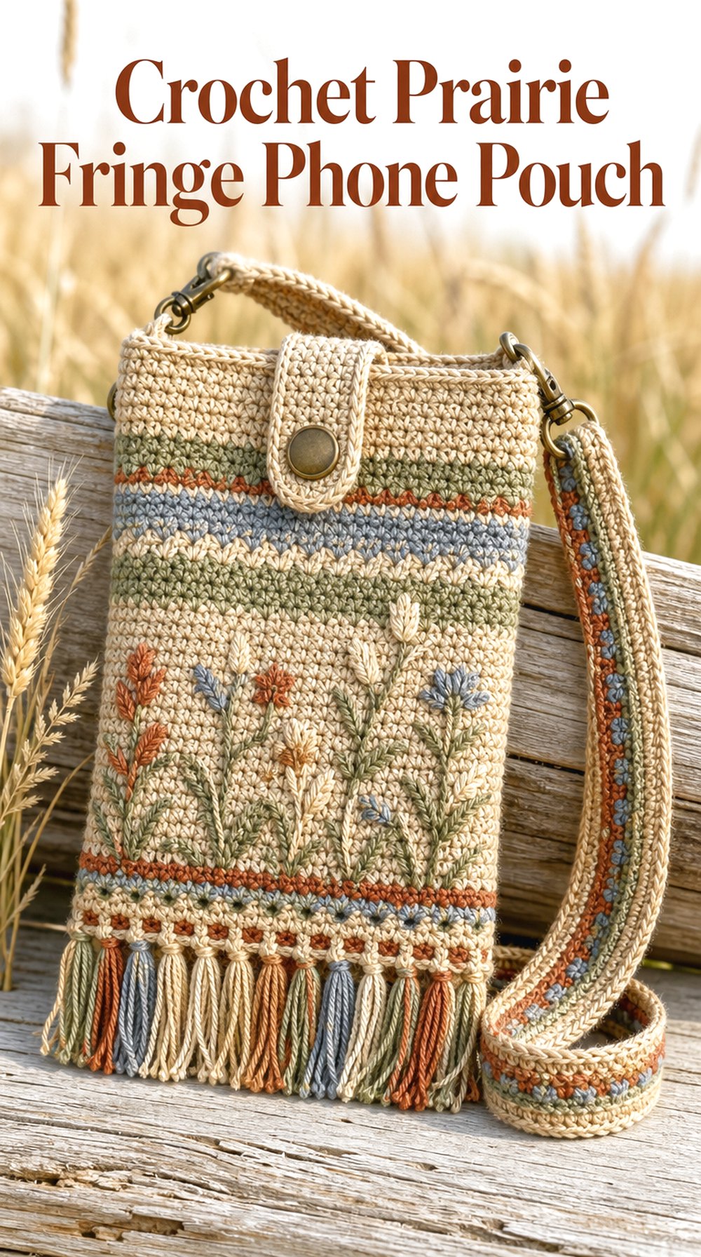 Save
SaveWheat, oat, faded blue, rust, and sage create a drier prairie-meadow palette with a relaxed Western edge. Short fringe along the bottom introduces movement and changes the silhouette, while understated floral or stripe details keep the countryside influence present. It feels more rustic than the cottage-inspired concepts but still strongly connected to meadow color.
Visual Focus
The fringe naturally draws attention to the lower edge, so the upper portion benefits from simpler decoration. A few horizontal accents or sparse floral details can keep the silhouette from appearing overloaded.
Color Mood
Faded shades suit this idea better than very saturated colors. Wheat and oat form a neutral base, while rust and muted blue add enough contrast to keep the palette interesting.
Creative Variation
For a more modern prairie look, use only cream, rust, and charcoal with shorter fringe. For something softer, swap rust for dusty rose and charcoal for sage.
19. Midnight Meadow Floral Phone Pouch
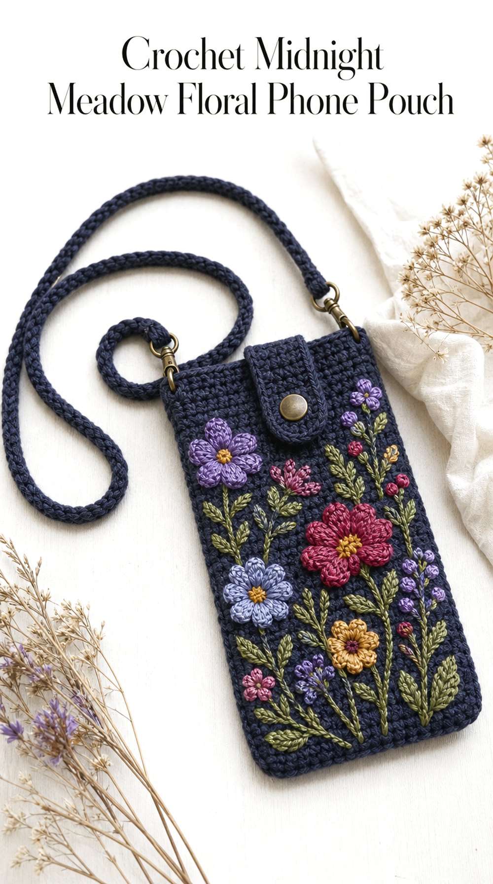 Save
SaveA midnight navy or charcoal background transforms wildflower colors into something moodier and more dramatic. Violet, berry, muted gold, blue, and leafy green accents stand out sharply against the dark surface, giving the pouch the feeling of a meadow seen at dusk rather than midday. It is an expressive option for anyone who prefers deeper palettes.
Why This Look Works
A dark ground acts like a frame around every floral color. Even relatively muted blossoms can look vivid when surrounded by charcoal or navy, so the design does not need excessive decoration.
Visual Balance
Leave visible stretches of the dark base between floral accents. That negative space is what gives the lighter motifs their impact and helps the pouch maintain a sophisticated rather than crowded appearance.
A Softer Variation
Choose deep slate blue instead of near-black and use lavender, dusty rose, sage, and cream for the flowers. The result keeps the dusk-inspired mood but reduces the dramatic contrast.
Choosing Between the Meadow Looks
| Style Direction | Best Place to Start |
|---|---|
| Light and classic | Daisy-Dotted or Chamomile Cream |
| Romantic cottage | Pink Clover or Blue Cornflower |
| Modern and graphic | Sunlit Meadow Color-Block |
| Highly textured | Meadow Green Bobble |
| Patchwork character | Wildflower Granny Square |
| Warm and earthy | Golden Hour or Prairie Fringe |
| Dramatic floral | Berry Blossom or Midnight Meadow |
| Quiet neutral | Pressed-Flower Neutral |
Wildflower Color and Style Inspiration
For a fresh spring meadow, combine leaf green, white, butter yellow, and cornflower blue. A cottage garden can lean toward dusty rose, lavender, cream, and moss. For late summer, consider honey, terracotta, muted berry, and olive. A woodland meadow works well with fern green, bark brown, cream, and faded florals, while a dusk palette can mix navy, plum, raspberry, muted gold, and sage.
Texture can shift the mood just as much as color. Granny-square motifs feel nostalgic and graphic, bobbles add playful dimension, scallops soften an edge, and smooth color blocking gives the wildflower palette a more contemporary personality.
Make the Idea Your Own
You do not need to borrow an entire concept for it to be useful. Take the tiny daisies from one idea and combine them with the muted palette of another, or use a dramatic dark base with simpler edging. You can also change the visual scale: a few oversized flower motifs feel bold, while scattered miniature blossoms look delicate.
Consider the strap as part of the design rather than an afterthought. A matching strap creates continuity, a contrasting strap introduces color blocking, and a longer crossbody look can make the pouch more visible as part of an outfit. Fringe, scallops, leafy accents, flower clusters, and neutral borders offer additional ways to shift the personality.
Using the Inspiration
Save the concepts that immediately catch your eye, then compare what they have in common. You may discover that you consistently prefer cream backgrounds, small motifs, darker greens, or simple straps. The ideas can also help with planning a color mood board, choosing between floral and geometric styling, comparing seasonal palettes, exploring gift directions, or collecting decorative details for future crochet references.
Who These Ideas Are For
This collection is useful for crochet lovers looking for fresh accessory inspiration, Pinterest users gathering phone-pouch references, anyone exploring cottage or meadow-inspired color palettes, and readers deciding between floral, textured, patchwork, neutral, or more contemporary crochet styles.
FAQ
Which wildflower colors are easiest to combine in a phone pouch?
Cream, green, dusty blue, muted yellow, and soft pink form a flexible starting palette because they can be rearranged into both cottage and modern looks. Keeping one neutral or green shade consistent helps several floral colors feel connected.
How can I make a wildflower-inspired pouch look more modern?
Use simpler shapes and reduce literal floral details. Broad color blocking, a limited three-color palette, clean edging, or one oversized botanical accent can preserve the meadow influence while giving the accessory a more contemporary feel.
What if I prefer neutral crochet accessories?
Try the Pressed-Flower Neutral or Chamomile Cream directions. Oatmeal, flax, mushroom, ivory, and faded botanical accents can suggest meadow flowers without relying on bright color.
How can I keep multiple flower colors from looking too busy?
Give the eye a consistent background color and repeat only a few accent shades. Leaving visible space between motifs also matters; the base texture can become part of the composition rather than every area needing decoration.
Which details create the strongest cottage feel?
Small floral motifs, cream backgrounds, dusty garden colors, scalloped edges, granny-square references, and gentle green accents all lean toward cottage styling. Combining only two or three of these details usually feels more balanced than using everything at once.
Can these ideas work beyond spring?
Yes. Shift the palette with the season rather than abandoning the meadow theme. Honey, rust, olive, and berry suit late summer and fall, while deep blue, plum, cream, and muted green can carry floral inspiration into cooler seasons.
Conclusion
Wildflower meadow inspiration can move in many directions, from tiny white daisies and pale lavender stripes to earthy prairie fringe and dramatic midnight florals. Start by choosing the detail you respond to most—perhaps a palette, edging shape, texture, motif scale, or strap style—and compare a few concepts before settling on your favorite direction. Even borrowing one small element can give a future crochet phone pouch a distinctive meadow-inspired mood.
