
Forest-floor colors offer a rich alternative to brighter handbag palettes, drawing inspiration from moss, bark, mushrooms, stones, fallen leaves, pine needles, and shaded woodland plants. These 14 crochet purse ideas explore that earthy range through curved shoulder bags, compact crossbodies, structured shapes, relaxed silhouettes, patchwork looks, and motif-based designs.
The collection is intended as visual inspiration and creative reference rather than exact project directions. Use the ideas to compare color combinations, think about texture and silhouette, plan an autumn or year-round accessory palette, or simply identify a detail you would like to carry into a future crochet purse.
About These Ideas
These purse concepts are shared for visual inspiration, color exploration, style comparison, and creative planning. Focus on the shapes, palettes, textures, straps, trims, and decorative details that suit your own style.
Quick Idea Finder
| If You Like… | Explore |
|---|---|
| Deep woodland neutrals | Wet-Bark Chocolate, Forest-Shadow Hobo |
| Soft muted greens | Lichen Sage, Fern Green |
| Warm autumn tones | Acorn Caramel, Leaf-Litter Patchwork |
| Modern understated bags | Forest Stone, Clay-and-Moss Colorblock |
| Lighter earthy palettes | Mushroom Taupe, Birch-and-Moss Cream |
| Rich statement color | Woodland Berry Crossbody |
| Decorative crochet texture | Evergreen Woodland Motif |
| Compact shapes | Pine-Needle Bronze Clutch, Lichen Sage Envelope |
Before You Choose
Think first about how much visual weight you want the purse to have. Dark colors and dense texture can make a bag feel grounded and substantial, while mushroom, cream, and sage shades create a lighter mood. Also compare strap width, silhouette, edging contrast, motif scale, and color placement. A woodland palette does not have to feel rustic; cleaner shapes and restrained color blocking can make forest-inspired colors look distinctly modern.
1. Crochet Moss and Bark Crescent Purse
 Save
SaveA crescent purse feels especially natural in a forest-inspired palette because its curved silhouette softens the visual weight of deeper greens and browns. Imagine moss green across the main body, framed by bark-colored edging and a coordinating strap. The result has an earthy quality without relying on obvious leaf or woodland motifs, making it easy to style beyond autumn.
Why the Curve Works
The rounded lower edge introduces movement and keeps darker earth colors from feeling too heavy. A clean crescent shape can also make visible crochet texture feel more refined because the eye follows one continuous silhouette rather than multiple decorative elements.
Keeping the body simple allows the color relationship between moss and brown to become the main feature.
Forest Color Balance
A deep olive or moss shade works well as the dominant tone, while walnut, chestnut, or dark bark brown can define the strap and outer edge. The contrast should feel noticeable but closely related.
For a calmer variation, choose two colors with similar depth. For a stronger graphic effect, use a lighter moss green against espresso-brown trim.
Outfit Pairing
This purse direction would sit comfortably beside denim, oatmeal knits, camel coats, olive jackets, or simple black clothing. The curved shape keeps the palette feeling casual and wearable rather than overly outdoorsy.
A wider strap creates a more relaxed impression, while a narrower strap makes the same color story look a little cleaner.
2. Crochet Mushroom Taupe Flap Purse
 Save
SaveMushroom taupe brings the quieter side of the forest floor into a crochet purse. A compact flap silhouette in gray-beige, soft brown, and muted stone tones feels understated and adaptable. The flap gives the design a clear focal point, while the restrained palette lets stitch definition and subtle edging create interest without needing bright contrast.
Color Mood
Mushroom shades can move between warm beige, soft gray, and earthy brown depending on the surrounding colors. That flexibility makes this direction especially useful if you prefer accessories that coordinate with many outfits.
A slightly deeper brown around the flap can add definition while keeping the overall look tonal.
The Flap as a Focal Point
A clean flap changes the visual structure of a crochet purse by creating a strong horizontal or angled line across the front. On a quiet neutral bag, that single design feature may be enough to make the silhouette feel deliberate.
Avoid crowding the front with too many competing details if the soft color palette is part of the appeal.
Everyday Styling Direction
Pair mushroom taupe with cream, denim blue, charcoal, muted sage, or camel. It can work through several seasons because it does not depend on distinctly autumnal orange or rust.
For a softer woodland mood, add oatmeal edging. For more contrast, introduce dark walnut brown.
3. Crochet Fern Green Mini Tote Purse
 Save
SaveA mini tote lets fern green take center stage. The upright silhouette feels crisp, while paired handles give the purse enough structure to balance the organic color. Instead of using one flat green, imagine subtle shifts between fresh fern, muted olive, and deeper leafy tones so the crochet texture becomes part of the woodland effect.
Shape Inspiration
A compact tote shape gives green a more contemporary character than a highly decorative purse might. Straight sides and defined handles create visual order, which is especially useful when the yarn texture itself is prominent.
The bag can feel playful in a very small scale or more practical when the proportions are slightly roomier.
Green-on-Green Direction
Layering related greens can create depth without introducing obvious color blocking. Fern, olive, moss, and muted pine each carry a slightly different mood.
Using the lightest shade near the upper edge can visually lift the silhouette, while darker green near the base gives the bag a grounded look.
Modern Styling
Fern green looks strong against cream, washed denim, beige linen, chocolate brown, and black. A clean outfit allows the green purse to act as the main accent.
For a fresher spring interpretation, pair it with ivory. For fall, bring in warm brown or muted bronze accessories.
4. Crochet Wet Bark Chocolate Shoulder Purse
 Save
SaveDeep chocolate brown captures the saturated look of tree bark after rain. In a crochet shoulder purse, that color can feel rich, textural, and unexpectedly sophisticated. A relaxed rectangular body keeps the focus on the dense brown surface, while slight variations between chocolate, espresso, and dark walnut prevent the palette from appearing flat.
Texture Direction
Dark brown benefits from visible stitch definition because texture creates the highlights that a brighter color would naturally provide. Raised lines, subtle ribbed effects, or clearly defined rows can give the surface more dimension.
The goal visually is depth rather than excessive decoration.
Rich Brown Variations
Instead of using a single brown everywhere, consider how neighboring earthy shades could define different areas. Espresso edging, chocolate across the body, and a softer walnut strap can make a tonal purse feel layered.
A tiny touch of muted olive could also reinforce the forest-floor theme without changing the overall brown impression.
Practical Style Angle
Chocolate brown works much like black but feels warmer. It pairs easily with denim, cream, olive, tan, rust, burgundy, and other natural neutrals.
A shoulder-length strap emphasizes its everyday character, while a longer strap would shift the same palette toward a more casual crossbody feel.
5. Crochet Lichen Sage Envelope Purse
 Save
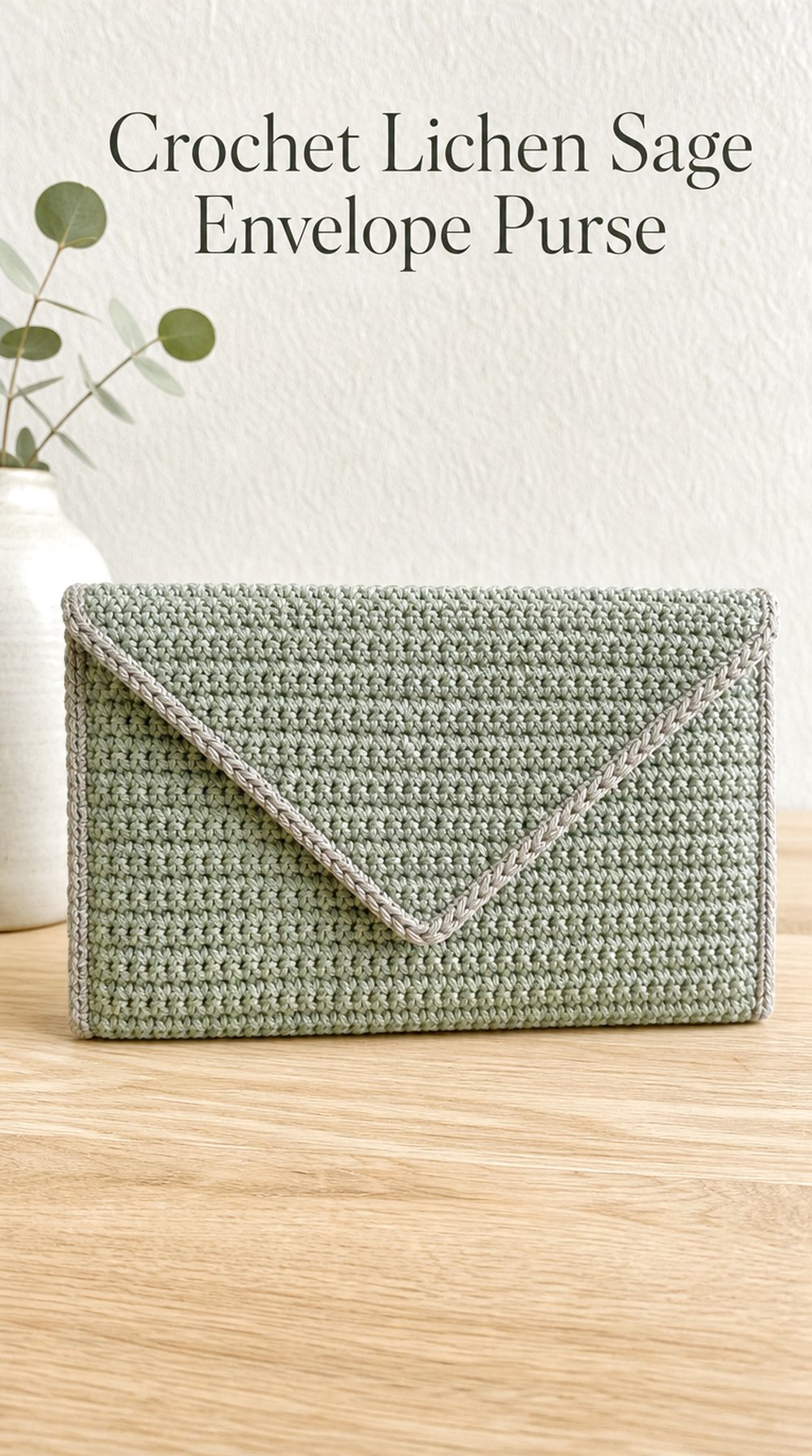
SaveMuted sage mixed with gray-green creates a quiet lichen-inspired palette that feels lighter than traditional forest green. An envelope-style silhouette adds a clean geometric element, creating a purse that can lean minimalist even though the surface remains unmistakably crochet. Subtle edging rather than bold decoration keeps the focus on the unusual soft green.
Why This Look Feels Calm
Sage has enough green to suggest nature but enough gray to work almost like a neutral. Combined with a flat envelope shape, it creates a controlled, uncluttered visual direction.
This is a useful choice if darker woodland palettes feel too heavy for your wardrobe.
Detail Worth Borrowing
The triangular or angled flap is the defining detail. Its clean point provides contrast against the softer yarn texture and gives the purse a recognizable front view.
Keeping trim close in color allows that geometry to stand out without introducing another strong visual element.
A Softer Variation
Shift the palette toward lichen gray, pale sage, mushroom, and warm ivory for an airy version. This combination would suit transitional seasons especially well.
For a slightly moodier interpretation, deepen the edge to dusty olive or muted eucalyptus green.
6. Crochet Acorn Caramel Bucket Purse
 Save
SaveWarm caramel and chestnut tones give a bucket purse the cozy richness of acorns scattered across dry leaves. The rounded base and gathered-looking upper silhouette already have an organic quality, so the palette feels naturally connected to the form. A tonal strap and restrained top detail can keep the design earthy without becoming overly rustic.
Warmth Through Color
Caramel provides a golden warmth that sits between tan and brown. Pairing it with toasted chestnut or a darker acorn shade gives the purse depth while maintaining a warm tonal range.
A tiny amount of oatmeal or mushroom beige could soften the palette if you prefer less contrast.
Shape Balance
Bucket purses carry more volume visually than flat shoulder bags, so color placement can help balance the shape. A deeper lower portion makes the base feel grounded, while a lighter upper edge can draw the eye upward.
A defined strap also prevents the rounded body from looking visually isolated.
Seasonal Twist
This direction feels especially appropriate for late summer through fall, but caramel can easily extend into winter when paired with cream, dark brown, or forest green clothing.
For spring, combine the same warm base with soft sage rather than chestnut.
7. Crochet Pine Needle Bronze Clutch Purse
 Save
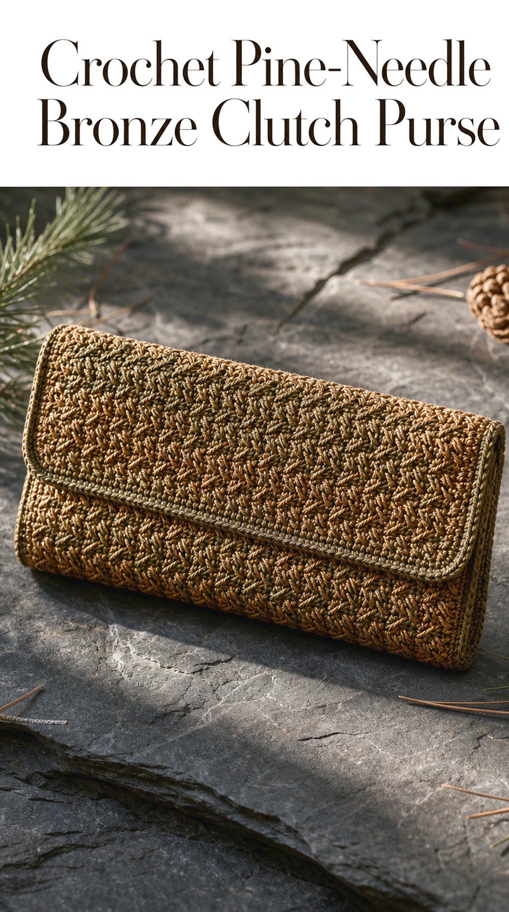
SavePine needles introduce a dry, bronzed brown that is subtler than bright autumn orange. On a streamlined crochet clutch, muted bronze and deep olive-brown can look polished rather than seasonal. The long horizontal silhouette gives the earthy color room to breathe, while crisp edging keeps the hand-held shape from becoming visually soft.
Understated Statement Color
Bronze-toned brown is interesting because it reads as neutral at first glance but carries more warmth than gray or chocolate. It works particularly well when you want a purse to feel distinctive without using a saturated color.
A shadowy olive accent can strengthen the woodland connection.
Visual Focus
With a clutch, the outer contour matters because there is no long strap to frame the design. A clean rectangular or gently rounded form helps the eye focus on texture and color.
One defined edge in dark brown can add enough contrast to make the silhouette feel finished.
Evening-to-Day Styling
Pair this palette with black, ivory, deep green, camel, or muted gold-toned accessories for a dressed-up woodland mood. Against denim or a simple neutral dress, it becomes more relaxed.
Its compact form also makes it a good reference if you prefer subtle crochet accessories rather than larger textured bags.
8. Crochet Woodland Berry Crossbody Purse
 Save
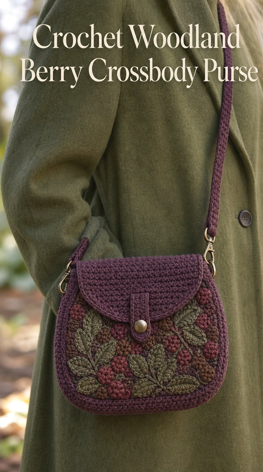
SaveNot every forest-floor palette needs to stay green and brown. Muted blackberry, deep plum, and dusty burgundy can suggest the small berries and dark plant colors tucked between leaves. A compact crossbody shape keeps those richer shades practical, while brown or forest-green accents connect the purse back to the woodland theme.
A Richer Color Mood
Plum brings depth without becoming as severe as black. Mixing it with muted berry and brown creates a palette that feels warm, moody, and especially effective in fall and winter.
For a quieter version, reduce the burgundy and let deep plum dominate.
Contrast That Still Feels Natural
Forest brown, muted olive, or charcoal can outline the berry tones without feeling disconnected. These darker neutrals act like shadows around the stronger color.
Cream edging would create a brighter, more graphic look, while brown edging keeps everything subdued.
Outfit Pairing
This purse could become the color accent in an otherwise neutral outfit. Think charcoal coats, oatmeal sweaters, dark denim, camel jackets, or black dresses.
It can also work alongside olive clothing because green and berry tones naturally create a richer complementary contrast.
9. Crochet Forest Stone Structured Purse
 Save
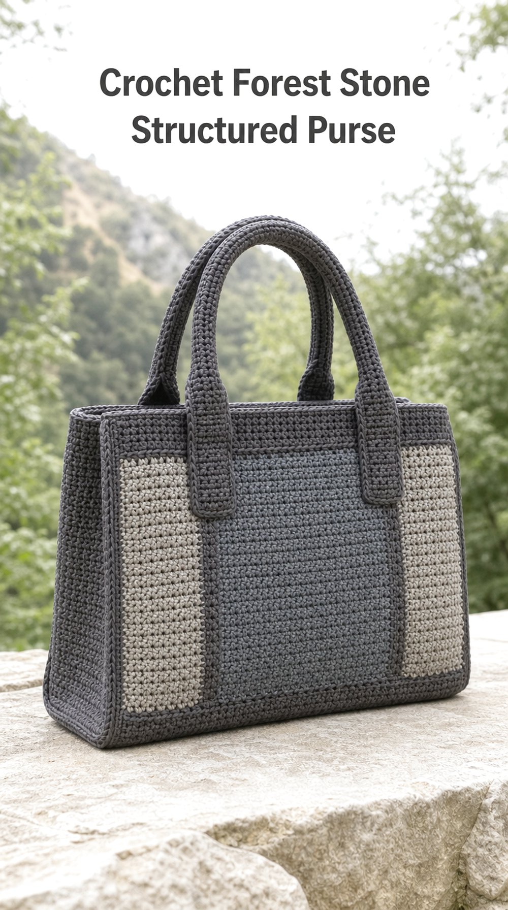
SavePebble gray and slate may not be the first colors associated with woodland crochet, but stones scattered among leaves create an important cooler layer in a forest-floor palette. A structured rectangular purse suits these shades particularly well. Defined handles and a clean outline can make the crochet texture feel architectural while remaining soft enough to retain its handmade visual character.
Cool Neutral Direction
Combine pebble gray, slate, charcoal, and perhaps a muted brown-gray for a palette that feels calm and contemporary. The cooler colors create contrast within a collection dominated by moss and bark shades.
A tiny touch of lichen green can keep the stone inspiration connected to the forest.
Visual Balance
Structured silhouettes benefit from clear proportions. Strong handles, an even body shape, and restrained edging allow texture to decorate the surface without disrupting the outline.
If the stitches are visually busy, keeping the color treatment tonal can help preserve that balance.
Modern Update
This is one of the easiest woodland directions to style in a minimalist wardrobe. Gray works naturally with black, white, camel, denim, and muted green.
For an especially modern version, keep hardware-like decorative accents minimal and let the contrast between crochet texture and clean geometry provide the interest.
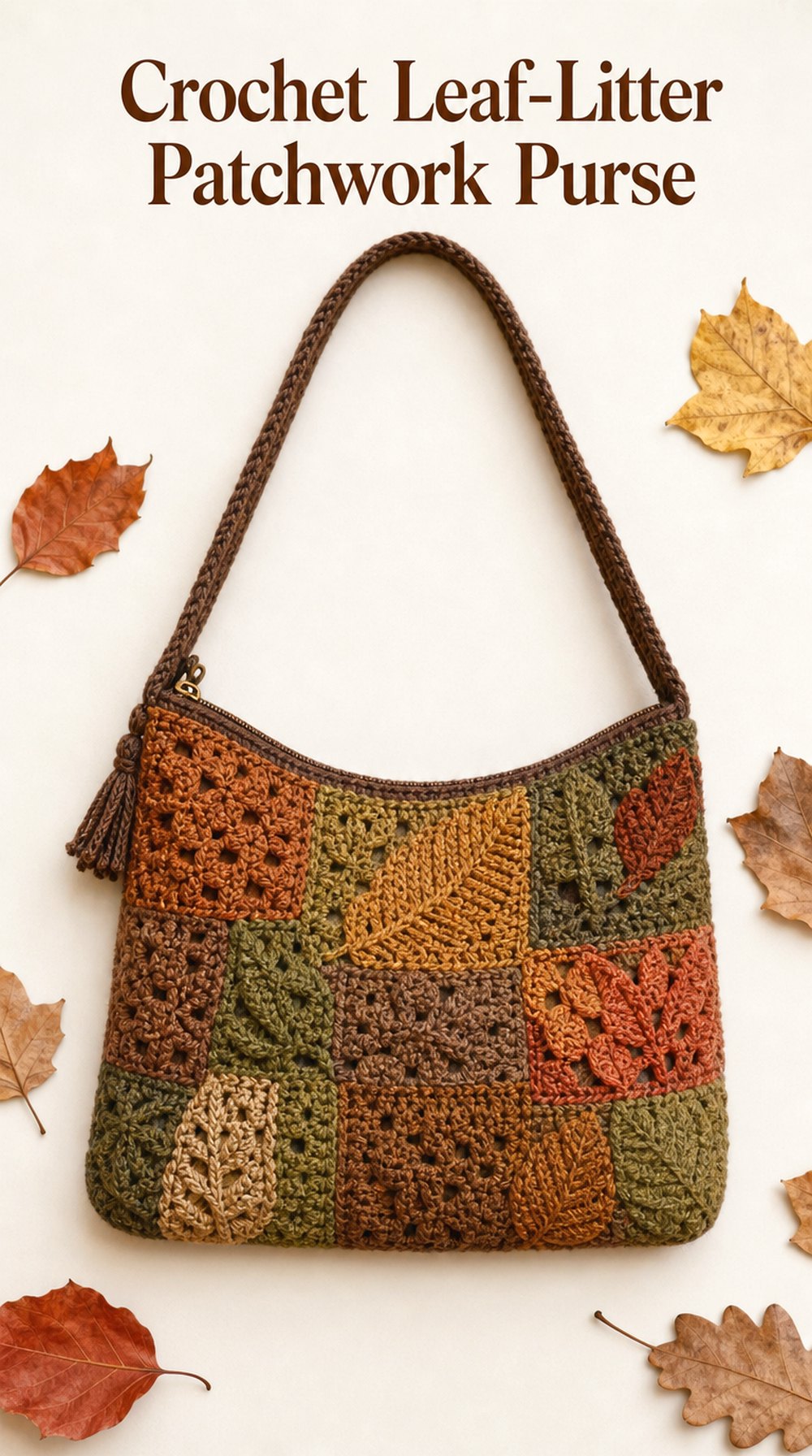
10. Crochet Leaf Litter Patchwork Purse
 Save
SaveA patchwork purse is a natural place to explore the many colors scattered across a forest floor at once. Rust, muted mustard, moss, soil brown, dried-leaf tan, and faded olive can appear in separate crochet panels or motifs. The key is creating enough repetition that the palette feels intentional rather than like a collection of unrelated leftovers.
Color Rhythm
Choose two or three dominant shades and use the remaining colors as smaller accents. For example, moss and brown could anchor the design while rust and muted mustard provide brighter interruptions.
Repeating a color in different areas helps visually connect the patchwork sections.
What Makes It Stand Out
Patchwork naturally highlights changes in texture, color, and motif placement. That makes the purse more decorative than a simple solid-color shoulder bag.
A plain strap can provide a useful visual pause and prevent the entire silhouette from feeling overly busy.
A Cleaner Version
If full multicolor patchwork feels too bold, limit the palette to rust, bark brown, and moss. Keeping every panel within the same muted depth creates a more cohesive look.
You could also imagine a neutral border surrounding more colorful interior sections to visually organize the design.
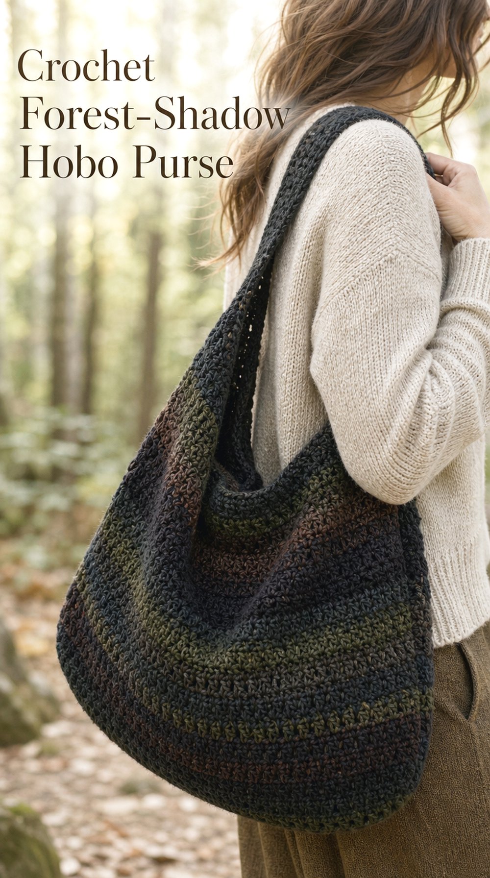
11. Crochet Forest Shadow Hobo Purse
 Save
SaveCharcoal, near-black green, deep brown, and dark olive capture the shadowed areas beneath dense woodland growth. A soft hobo silhouette suits these colors because its relaxed shape prevents the dark palette from feeling rigid. The result can be moody and contemporary, especially when the crochet surface has enough definition to catch the light.
Silhouette Matters
A hobo purse depends on its curved, softly collapsing outline. In dark shades, that drape becomes part of the visual interest because highlights naturally emphasize the folds and crochet texture.
A substantial strap helps frame the relaxed body and gives the purse a stronger overall shape.
Dark Woodland Palette
Instead of relying on pure black, combine charcoal with very deep olive and espresso. Those slight shifts create a more natural sense of depth.
A single muted moss section could introduce contrast without turning the purse into an obvious color-block design.
Where This Look Fits
This direction suits cool-weather wardrobes especially well. It pairs with oversized knits, wool coats, leather jackets, denim, and long neutral layers.
It is also a useful choice for someone who likes earthy themes but generally wears darker accessories.
12. Crochet Birch and Moss Cream Purse
 Save
SavePale bark, dry grass, and soft moss can inspire a much lighter woodland purse. An oatmeal or creamy crochet body with moss-green trim gives the forest-floor theme a fresh, airy quality. Small tan accents can add warmth, while the restrained two- or three-color palette keeps the design easy to coordinate with everyday outfits.
Light Woodland Color Story
Cream acts as visual breathing room, allowing moss green to look more vivid without becoming bright. Warm oatmeal may feel more natural than stark white alongside earthy colors.
A small amount of tan can bridge the difference between the light body and green edging.
The Detail That Changes It
Trim placement can completely alter the mood of this purse. Green only around the outer edge feels clean and graphic, while green straps and edging create a stronger two-tone appearance.
If you want a quieter look, keep the strap cream and use moss only as a narrow accent.
Seasonal Flexibility
The lighter base works especially well for spring and early fall, but it can also brighten winter clothing. Pair it with denim, camel, sage, chocolate, or soft gray.
This palette is a good reference for readers who like woodland colors but do not want a dark accessory.
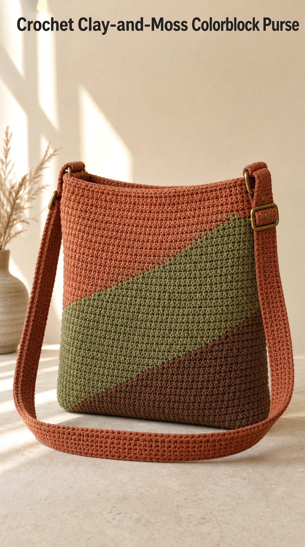
13. Crochet Clay and Moss Colorblock Purse
 Save
SaveClay terracotta and moss green create one of the strongest warm-cool pairings in a forest-floor palette. On a simple rectangular purse, broad color blocks can turn those natural shades into a modern graphic statement. Soil brown works well as a third grounding tone, especially along the strap, base, or edging.
Why This Combination Works
Clay carries warmth from earth and fallen leaves, while moss contributes the cooler plant tone. Because both colors are muted, the contrast feels expressive without becoming overly bright.
Adding brown helps visually connect the two sides of the palette.
Placement Idea
Large color areas usually feel calmer than many small stripes. One clay section beside or beneath a moss section creates a clear composition that can be understood from a distance.
A dark brown strap could act as a frame, keeping the stronger colors contained within the silhouette.
Bolder Variation
Increase the clay area and use deeper evergreen instead of muted moss for a more dramatic purse. A charcoal edge could make the whole combination feel more contemporary.
For a softer version, shift clay toward dusty terracotta and moss toward gray-green sage.
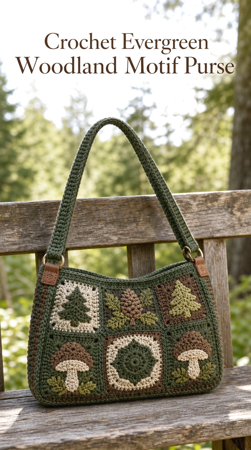
14. Crochet Evergreen Woodland Motif Purse
 Save
SaveCrochet motifs offer a natural way to combine several forest colors while keeping each shade clearly defined. Evergreen, pine, olive, mushroom cream, and bark brown can appear in repeating squares or other decorative units across the purse. A consistent border or strap color helps connect the motifs so the final visual impression feels coordinated rather than overly busy.
Motif Color Planning
Repeating the same core colors in different arrangements can create variety while preserving cohesion. Evergreen might dominate one motif, mushroom another, and olive a third, with brown appearing throughout as the unifying shade.
Keeping saturation muted helps the individual sections sit comfortably beside one another.
Decorative Focus
The motifs already supply strong surface detail, so the purse silhouette can remain relatively straightforward. A simple body shape gives the eye space to appreciate color changes, edges, and individual crochet textures.
A solid strap is another useful way to balance the patterned surface.
Creative Variation
For a lighter woodland interpretation, increase mushroom cream and olive while reducing deep evergreen. For a moodier direction, use pine, charcoal, and bark brown as the main shades.
The same motif concept can feel cottage-inspired, vintage-influenced, or modern depending largely on palette and spacing.
Choosing Between the Purse Concepts
| Style Direction | Best Match |
| Soft and neutral | Mushroom Taupe Flap |
| Deep and sophisticated | Wet-Bark Chocolate Shoulder |
| Light woodland | Birch-and-Moss Cream |
| Modern and graphic | Clay-and-Moss Colorblock |
| Decorative and colorful | Leaf-Litter Patchwork |
| Moody and relaxed | Forest-Shadow Hobo |
| Compact statement | Woodland Berry Crossbody |
| Minimal and cool-toned | Forest Stone Structured |
| Naturally green | Fern Green Mini Tote |
If you are undecided, start with silhouette. Once you know whether you prefer structured, slouchy, compact, or roomy shapes, choosing a forest-inspired palette becomes much easier.
Forest-Floor Color and Style Inspiration
Try building a palette around one dominant forest-floor element rather than using every woodland shade at once. Moss + bark + oatmeal feels classic and grounded; mushroom + sage + stone is softer; rust + soil brown + muted mustard creates an autumn mood; charcoal + evergreen + espresso feels dramatic; and clay + moss + walnut offers a more modern color-block direction.
Texture can reinforce the palette too. Dense surfaces suit bark and stone colors, while more visible motif changes or textured details can bring leaf-litter and moss-inspired combinations to life.
Make the Idea Your Own
Personalization can be as simple as changing which color dominates. Turn a moss-green purse into a cream purse with moss edging, or reduce a multicolor patchwork idea to three closely related shades.
You can also explore:
- Wider or slimmer strap proportions
- Tonal versus contrasting edging
- Large blocks of color instead of many small changes
- Motifs concentrated on one section of the purse
- Fringe or tassel accents used sparingly
- Rounded silhouettes instead of rectangular ones
- Dark bases paired with lighter upper sections
- Seasonal changes such as rust for fall or sage for spring
Borrowing one detail is often enough. A bark-brown strap, lichen-green flap, berry accent, or stone-gray body can introduce the forest-floor theme without defining the entire purse.
Using the Inspiration
Use these ideas to build a crochet purse mood board, narrow down an earthy palette, compare bag silhouettes, explore strap and trim combinations, or save references for future creative planning. You can also compare the concepts against clothes you already wear to see whether warmer browns, cooler greens, soft neutrals, or deeper woodland shades would fit your wardrobe best.
Who These Ideas Are For
This collection may appeal to crocheters and crochet lovers who enjoy earthy palettes, woodland styling, autumn accessories, muted colors, nature-inspired design, or simply want alternatives to brighter purse color combinations. It is also useful for anyone comparing crochet bag shapes before choosing a visual direction.
FAQ
What colors work best for a forest-floor crochet purse?
Moss green, bark brown, mushroom taupe, stone gray, rust, clay, muted mustard, olive, evergreen, and oatmeal all fit naturally into the theme. You do not need to use them together. Two or three related shades often create a more focused purse.
How can I make woodland colors look modern instead of rustic?
Use a clean silhouette and simplify the color placement. Broad color blocks, tonal palettes, restrained edging, and structured purse shapes can make moss, clay, brown, and stone shades feel contemporary.
Which forest-inspired palette is easiest to wear?
Mushroom taupe, chocolate brown, moss green, oatmeal, and charcoal are especially versatile because they coordinate with many wardrobe neutrals. A purse combining two of these colors can feel distinctive without becoming difficult to style.
Can a forest-floor purse use colors other than green and brown?
Absolutely. Muted berry, plum, rust, stone gray, cream, bronze, dusty mustard, and terracotta all appear naturally within a woodland-inspired color story. Using one unexpected shade can make the palette more personal.
How do I keep a multicolor purse from looking too busy?
Choose a small set of dominant colors and repeat them across the design. A solid strap, consistent edging, or one grounding shade such as bark brown can help visually connect multiple motifs or panels.
Which purse shape suits a darker woodland palette?
Relaxed shoulder bags, crescent purses, hobo silhouettes, and structured rectangular bags can all handle deeper colors well. If charcoal, evergreen, or espresso feels visually heavy, a curved silhouette or lighter contrasting edge can soften the overall effect.
Conclusion
Forest-floor colors can take a crochet purse in many directions, from soft mushroom neutrals and pale lichen greens to shadowy charcoal, berry plum, warm caramel, and leaf-litter patchwork. Choose the silhouette that feels most useful first, then notice which color relationship keeps drawing your attention. Save a favorite concept, compare two palettes side by side, or borrow one small detail—such as moss edging, bark-brown straps, or clay color blocking—as the starting point for your own creative direction.
